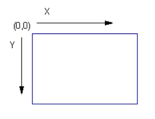
Figure 1: Title Block Origin
We recommend that you understand XML before creating or editing templates
The one-line title block template file is an XML file. This is a standard format for exchanging data for many web based and standalone applications and is easily extensible.
Items can be defined in any order and attributes can be in any order. There are 4 basic types of graphical objects that can be defined for title blocks: rectangles, lines, text and pictures. Each of these items has attributes that describe their positions, sizes, colors, and so on. The general file format is shown below:
<?xml version="1.0" encoding="utf-8" ?>
<TitleBlock>
>>> Title block item definitions go here
</TitleBlock>
All the coordinates in Title Block templates are in inches with the origin (0,0) being in the top left corner. The x coordinate increases left to right while the y coordinate increases top to bottom. There are no limits to how large a title block you can create. It can even be larger than the physical page you are printing on since you will have the option of scaling it down in the Print dialog.

Figure 1: Title Block Origin
When defining attributes for the objects you define, some attributes are required such as positioning attributes. Others are optional and if not specified, defaults are used.
The Settings section enables you to specify certain settings for the title block and can have the following options.
Scale [Optional] Scaling for title block [Default = 0]
0 = Automatic
1 = Manual (this value should not be used in a .TBLK file)
2 = Fit to right side
3 = Fit to bottom side
BorderWidth [Optional] Width of print border rectangle lines [Default = 1]
<Settings>
<Scale>0</Scale>
<BorderWidth>1</BorderWidth>
</Settings>
Rectangles are simply boxes and can have the following attributes.
left [Required] Left coordinate of rectangle in inches
top [Required] Top coordinate of rectangle in inches
right [Required] Right coordinate of rectangle in inches
bottom [Required] Bottom coordinate of rectangle in inches
LineWidth [Optional] Width of the line around the rectangle [Default = 2]
Color [Optional] RGB value of color of the rectangle line [Default = 0 (black)]
<Rect>
<left>0</left>
<top>0</top>
<right>7.25</right>
<bottom>0.75</bottom>
<LineWidth>2</LineWidth>
<Color>0xff0000</Color>
</Rect>
Lines can have the following attributes.
PosX1 [Required] Starting x value in inches
PosY1[Required] Starting y value in inches
PosX2 [Required] Ending x value in inches
PosY2 [Required] Ending y value in inches
LineWidth [Optional] Width of the line [Default = 2]
LineStyle [Optional] Style of the line [Default = 0]
0 = Solid
1 = Dash
2 = Dot
3 = Dash Dot
4 = Dash Dot Dot
Color [Optional] RGB value of color of the line [Default = 0 (black)]
<Line>
<PosX1>0</PosX1>
<PosY1>0</PosY1>
<PosX2>7.25</PosX2>
<PosY2>0.75</PosY2>
<LineWidth>2</LineWidth>
<LineStyle>0</LineStyle >
<Color>0xff0000</Color>
</Line>
Text can have the following attributes.
PosX [Required] Horizontal position of text in inches
PosY [Required] Vertical position of text in inches
Alignment [Optional] Alignment of text. This field determines how PosX and PosY are interpreted. It is specified as a combination of one of the horizonal alignment values with one of the vertical alignment values. A value of 30 (6 + 24) causes the text to be centered horizontally, with PosY being the baseline. [Default = 24 (Left Baseline)]
Left align 0
Right align 2
Center 6
Top 0
Bottom 8
Baseline 24
Label [Required] Text to display. This is static text unless the Prompt attribute is defined in which case this value is the default text.
Prompt [Optional] Prompt for label. Makes this text item a variable and specified by the user in the Print dialog box.
FontName [Optional] Font face name [Default = Arial]
Name [Optional] Field name [Default = none]
PointSize [Optional] Font point size [Default = 10]
Escapement [Optional] Font escapement specified in 1/10 of an angle. So for 90 degree text you would specify 900. [Default = 0]
Bold [Optional] Bold font [Default = 0]
0 = normal
1 = bold
Italic [Optional] Italic font [Default = 0]
0 = normal
1 = italic
Color [Optional] RGB value of color of the line [Default = 0 (black)]
<Text>
<PosX>3.625</PosX>
<PoxY>.25</PoxY>
<Alignment>30</Alignment>
<Color>0X0000000</Color>
<Label>CITY OF SEATTLE</Label>
<FontName>Arial</FontName>
<PointSize>10</PointSize>
<Escapement>0</Escapement>
<Bold>0</Bold>
<Italic>0</Italic>
</Text>
Images are pictures and can have the following attributes. Images will automatically be resized to fit the given rectangle while preserving the original aspect ratio of the image.
left [Required] Left coordinate of rectangle in inches
top [Required] Top coordinate of rectangle in inches
right [Required] Right coordinate of rectangle in inches
bottom [Required] Bottom coordinate of rectangle in inches
File [Required] Path of the graphics file. Supported files types are BMP, JPG, GIF, TIFF, PNG, ICO, WMF, EMF.
Prompt [Required] User prompt that is displayed in the Print dialog.
Name [Optional] Field name [Default = none]
<Image>
<left>0</left>
<top>0</top>
<right>7.25</right>
<bottom>0.75</bottom>
<File>d:\pictures\logo.jpg</File >
<Prompt>Logo image</ Prompt >
</Image>
| Printing and Plotting | |
| Title Block |

|