Pareto Charts
After you run a reliability evaluation, you can create Pareto charts that display your system reliability in a graphic format. Click Pareto Chart to create the chart.
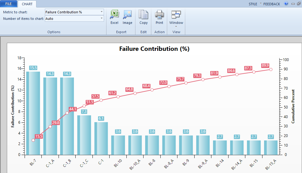
The Pareto chart is displayed.
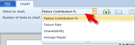
Metrics to Chart
There are multiple charts available. You can select the metric you want to chart, including:
- Failure Contribution %
- Failure Rate
- Unavailability
- Average Repair
Interpreting the Charts
The Pareto chart displays the most important factors from left to right. The red line displays the cumulative percent of the total.
In the Failure Contribution % chart shown above:
- Breaker BL-7 has the highest failure contribution, branch C-1_A has the next highest, branch C-1_B has the next highest, and so on.
- Breaker BL-7 contributes to 15.5% of the overall failure contribution, branch C-1_A is added to breaker BL-7's percentage for a combined total of 29.8% of the overall failure contribution, branch C-1_B is added to breaker BL-7 and branch C-1_A's percentage for a combined total of 44.1% of the overall failure contribution, and so on.
The charts enable you to focus your attention on the most critical areas of reliability in your power system, with the severity decreasing as you move left to right.
More Information
| Reliability Database View | |
|
|